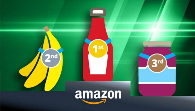
Amazon grocery is expected to grow at a rate of 22% per year and by 2019, the e-tailer is predicted to become one of the top 10 grocers in the United States. Amazon’s rise in grocery is attributed to their Prime membership offerings and the tendency of millennials to buy groceries online.
Amazon’s growing importance in grocery has forced food companies to re-think their approach to product content. In this guest post, content26 looks at how your brand can get started with content on Amazon to create a great shopping experience.

Brands with Effective Amazon Grocery Content
I recently got more than 7,000 hits when searching for “granola” on Amazon. So if you’re selling granola, how do you make sure your product stands out from the others on Amazon’s crowded digital shelf?
One common answer is to explore Amazon’s various advertising options help with discoverability. However, that answer is only available to brands with access to Amazon Vendor Central.
For all brands, it’s crucial to focus time and attention on product page content in order to optimize Amazon search engines and a smooth shopping experience.
I’ll prove advice for creating outstanding Amazon grocery content later on, but first, here’s our list of 5 Amazon grocery vendors that are setting the standard for product content:
- Similac (Abbott Laboratories)
- Nature Valley (General Mills)
- Izze (PepsiCo)
- Vega (WhiteWave)
- San Francisco Bay Coffee (Rogers Family Company)
The following brands also deserve an honorable mention: Enfagrow (Mead Johnson), bai (Bai Brands), LÄRABAR (General Mills), and Quaker (PepsiCo).
How They Do It: Understanding Product Page Content
To come up with our list, we looked at 107 vendors with multiple bestselling products in the Amazon grocery category over the past 12 months. Once we identified that elite group, we analyzed the product page content for Amazon compliance and adherence to industry best practices.
We evaluated essential content (product title, bullets, and basic description) as well as enhanced (Amazon A+) content.
Read on to find out what each of these brands are doing right.
Similac: Going Beyond the Basics
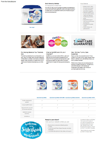 Abbott laboratories does a great job with its Similac Go & Grow product pages. In particular, the brand’s enhanced content stands out.
Similac’s enhanced content includes the following imager:
- High-resolution product shot
- Lifestyle image of mothers with babies
- Icons explaining important ingredients
- A product claim displayed graphically
In addition, the Similac enhanced content includes a linkable product matrix, making it easier to cross-sell other products in the product family.
While Similac’s enhanced content was top-notch, its essential content could have been better. There were some awkward claims made in bullets as well as an inconsistency between the product title and package labeling.
Nature Valley: Making Minimalism Work
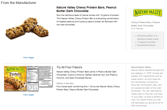
Often, grocery brands struggle to create good content because they don’t have much to say about their product. That’s why we wanted to give a shout-out to this General Mills-owned brand.
You can tell that Nature Valley doesn’t have much in the way of imagery, as they use photos of their packaging as part of their enhanced content, which is not something we recommend. Still, they include one product image as well as their brand logo.
And although they clearly have not found much of a story to tell about their product, the marketing team did include basic features and benefits as well as brand information.
Nature Valley’s essential content is similarly sparse yet informational. “Nature Valley Chewy Protein Bars, Peanut Butter Dark Chocolate, 5- 1.42 oz Bars (Pack of 4)” is not an especially exciting product title, but it does the job. For next steps, we would suggest including some lifestyle photography and inspirational copy to make this product more compelling to online shoppers.
San Francisco Bay Coffee: Strong Essentials
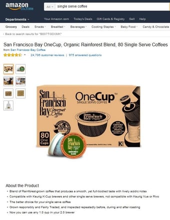 I’d like to offer a shout-out to San Francisco Bay coffee for their effective essential content.
The brand’s product titles do a great job of anticipating how shoppers search for coffee (single serve, organic) while keeping it clear and concise. Bravo!
Additionally, most of the product’s bullets work hard to explain the product, addressing issues such as compatibility with Keurig coffee makers and describing the “smooth, full-bodied taste.”
Of course there’s room for improvement, “The better choice for your single serve coffee” bullet adds nothing to a shopper’s understanding of the coffee of brand. Additionally, San Francisco Bay Coffee’s enhanced content is rambling and lackluster. Still, kudos to this crew for investing in compelling product and lifestyle photography.
IZZE: A Visual Feast
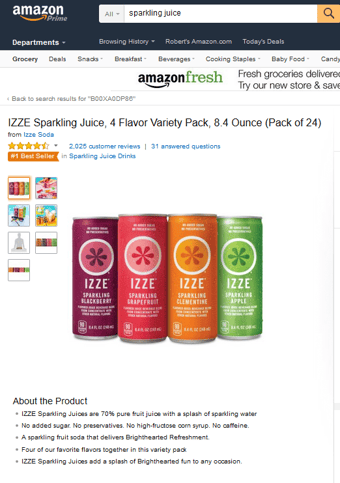 This PepsiCo-owned brand of carbonated drinks does a great job of showcasing its personality through product images. IZZE has multiple lifestyle images at the top of the page alongside beautiful product photography. The great product images extend down into the enhanced content, although the A+ page falls short on design with a series of lackluster left-aligned images.
Another shortcoming is an unnecessary FAQ section which answers questions about whether the beverage is vegan and gluten free. Not only do the answers to the FAQ seem forced, but the visual momentum is lost. In this case, FAQ information would be better left to the Customer Questions & Answers section.
Advice for Getting Started with Content
While none of the brands had perfect Amazon content, as a group they offer a starting point for grocery vendors looking to improve the branded shopping experience at the product page level. Here are some content recommendations for grocery brands.
- Get the basics right. Make sure every product has strong basic content such as product titles, bullets, and images. All online shoppers see of your products are the images you provide, so make sure you go beyond the standard product package shot.
- Consider enhancing your content. Investing in enhanced content allows you to tell the story of your product and brand. A+ content can be a critical tool for converting shoppers on your product page.
- Optimize for search. Your basic enhanced content should be optimized to help improve SERP rankings within Amazon as well as on external search engines.
- Consider Amazon Marketing Services. If your pages have all the content they need to succeed (or even if they don’t), consider adding targeted advertising. This will help increase page clicks; your exceptional content will lead to added conversions.
Trinity Hartman is Director of Content at content26, a global leader in enhanced eCommerce content development.
To stay up-to-date with the latest eCommerce grocery news and insights, you might also be interested in signing up to Profitero’s weekly Digital Shelf Digest.


